{ DESIGN }
———————————————————————-Please Scroll Down ——————————————————————————–
——————————————————————————————————————————
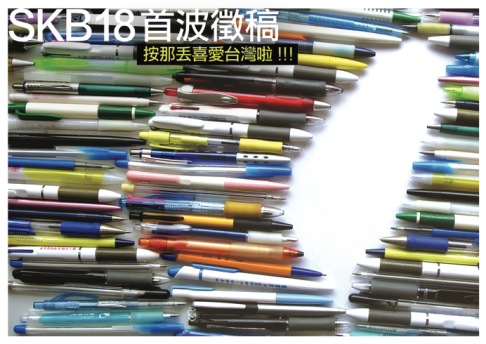
SKB18 Online magazine Issue 10
Object: Cover design, editorial layout
Description: The shape of the bundle of ball point pen is the shape of Taiwan in geography.
We invited contribution in this issue.
Various pens represent diverse voices from different Taiwanese. All of them gather together and become this issue.
——————————————————————————————————————————
Fragrance ads
Object: Poster design
Description: The fragrance can’t be seen but can be perceived. This is the main idea of this poster.
——————————————————————————————————————————
Puberty CD cover design
Object: CD cover design
Description: Age and the body’s outline have some subtle relationships.
Just like voiceprint, everyone has his or her own body contour map.
——————————————————————————————————————————
Shanhai Water Resources Foundation (SWRF)
Object: Logo design, business card, stationary, promotion pieces
Description: SWRF is a nonprofit organization that focuses on saving and protecting water resources.
The aim of their identity is to bring the relationship of water and nature together.
As for the promotional pieces, I designed different conditions of water and used them in patterns or collages that
draw people’s interest and attention as well as reminds them of the importance of water.
——————————————————————————————————————————
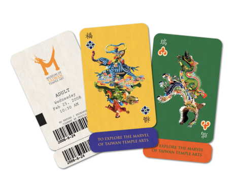
Museum of Taiwan Temple Art
Object: Logo design, business card, poster, ticket, stationary, banner
Description: This was an assignment from my visual communication class.
We needed to design a Museum’s visual system.
The challenge of this assignment was that I need to come up with a solution that could represent the complicated exotic culture in the plain way without losing its spirit.
Therefore, I extracted the most significant parts of the temple and made them into a logo.
In the image poster, I also utilize this idea and incorporated the stamp features to show the difference of visible and invisible treasure of the museum.
——————————————————————————————————————————
The Quirky Address Book
Object: Book design and Illustration
Description: This was a group project in my communication seminar class.
We were asked to discuss a special ritual and do some research of the theme we choose, assemble and design it into a book.
Our team was collecting different people’s special habits.
In order to bring the result together, we made it into a phonebook.
So this book will sort people not by their initial name but by their quirky rituals.
In this book, I was responsible for the color palette, illustration and type treatment in all the front dividers.
——————————————————————————————————————————
BELLA LUNA Italian Fine Restaurant
Object: Menu design
Description: Purple and gold represent elegance and luxury mood in this restaurant.
I used assorted tints to represent seperate meal time.
——————————————————————————————————————————
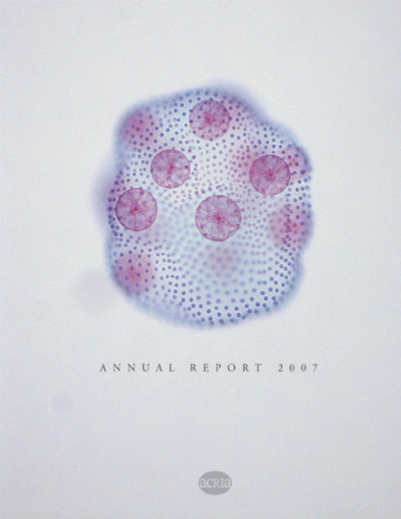
ACRIA 2007Annual Report
Object: Annual report
Description: The most significant feature of ACRIA (AIDS COMMUNITY RESEARCH INITIATIVE OF AMERICA) is the research.
In order to emphasize this, I apply images of cells to represent specialized research and to direct the reading flow as the visual element.
Purple-red color stands for ardent and urgent; gray represents professionalism and modesty.
——————————————————————————————————————————
Graduate thesis
Object: A research book of studies in the relationship between color, shape and human’s inner health in the space.
Description: This was my graduate thesis finished in 2009.
It concentrated on using design for uplifting people’s mental health.
In the final of my thesis, I found that this theory should be apply to the place that need more positive energy such as the hospital.
By using the proper colors and shapes that bring the comfortable illusion to people in the space; making them feel relax and peaceful.
——————————————————————————————————————————
Want to see more and downloadable version? Click here!
——————————————————————————————————————————













4 Comments
Jump to comment form | comment rss [?] | trackback uri [?]